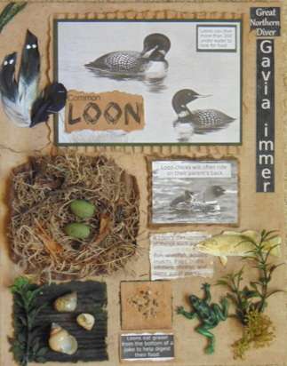
What are your options when you’ve created a piece of mixed media art that you don’t like? You went through the process of brainstorming and collecting the the right items. You thought it was all good and you fastened everything down.
But something is wrong. The art doesn’t make you happy; the more you look at it, the more you dislike it. That’s what happened to me. In the previous post, part 4 of the Loon Assemblage, I talked about the completion of my Common Loon assemblage art and my disappointment in the outcome.
I was tempted to call it quits because once I’ve completed a piece, I want to move on to something else. However, I decided that redoing it would be a good learning experience.
First, I tried to figure out exactly why I didn’t like it. I knew the text was an important component of my art so I needed a way to make it look less like a science project and more like a well-done scrapbook page. I had to get rid of some of the white space.
I started experimenting. For the wording in the upper right corner, I used GIMP, a photo editing program, to reverse the colors, from black words on a white background to white words on a black background. That looked a bit better.
I replaced the white background of the food factoid with textured brown cardstock.
Since loons have been known to eat snails, I thought it would be okay to replace the mostly white range map with shells that I found on one of my walks around the pond.
All in all, the art looks better, not quite what I’d hoped for, but I did learn a lot and I achieved some of the goals I had for this piece, which was to inform and to highlight some interesting facts about the common loon using a variety of textures and elements.
